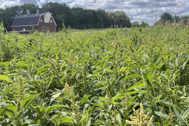
Ritch and Cynthia Berkland’s farm, located near Cylinder, Iowa, is a unique blend of row crops and wildlife habitat. Production fields and conservations areas flow seamlessly together, creating a cohesive balance between agriculture and wildlife. Over the decades, the Berklands have collaborated with various organizations to weave conservation into the fabric of their agricultural land. Their most recent success story comes from a partnership with Pheasants Forever, employing a strategy called precision conservation.
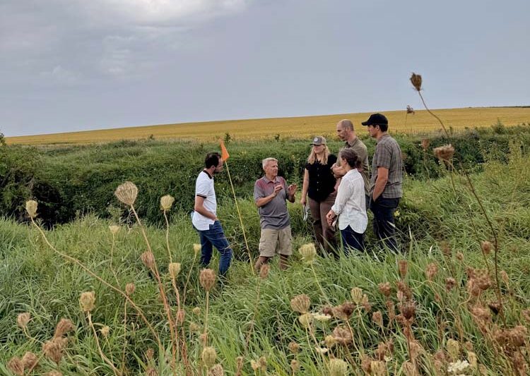
This innovative approach was the focus of an autumn 2025 field day hosted by Ritch and Cynthia, along with Stephanie Nelson and Josh Divan of Pheasants Forever and Practical Farmers of Iowa. Attendees of the field day saw firsthand how spatial technology and data analysis can identify underperforming acres. These marginal acres, which yield poorly, are then transitioned to perennial plantings.
Finding Just the Spot: CRP and Marginal Acres
Ritch and Cynthia own and farm their 160-acre century farm, along with 120 adjacent rented acres where they grow corn and soybeans and dedicate 100-acres to the Conservation Reserve Program. As Ritch explained, “This large conversion, which occurred incrementally, was a deliberate choice to provide a home and food source for wildlife and pollinators. Crucially, the move also made sound business sense.“
“It didn’t hurt that the rental payments from the CRP program made up for the fact that those 100 acres had never been profitable in crop production, and it made more sense to transition them to CRP, evergreens and food plots,” Ritch noted.
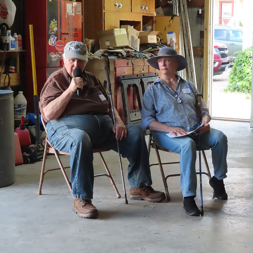
Stephanie reinforced this point: “Not every acre is going to produce favorable yield results, and those marginal acres can be made more profitable as habitat.”
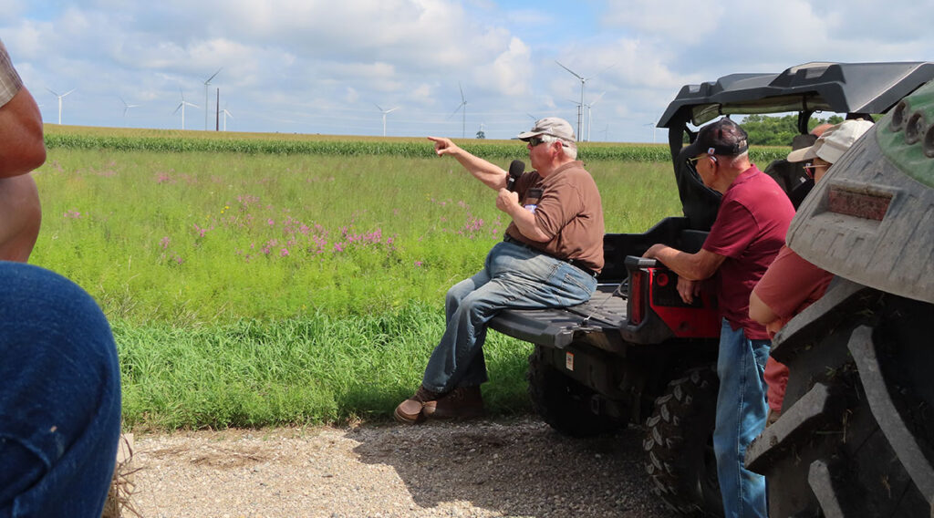
The Power of Precision Conservation
To identify these critical areas, precision agriculture and conservation specialists at Pheasants Forever use satellite imagery to give a clearer picture of crop yields over time. Images analyze soil, slope and vegetation patterns from year to year. When yield data is not available, PACS turn to normalized difference vegetation index. This metric uses satellite or drone imagery to measure the health and density of vegetation by comparing the amount of near-infrared light, a strong indicator of healthy plants. The more light that is reflected, the healthier the plants.
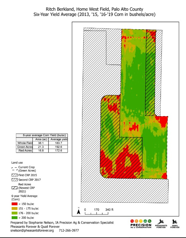
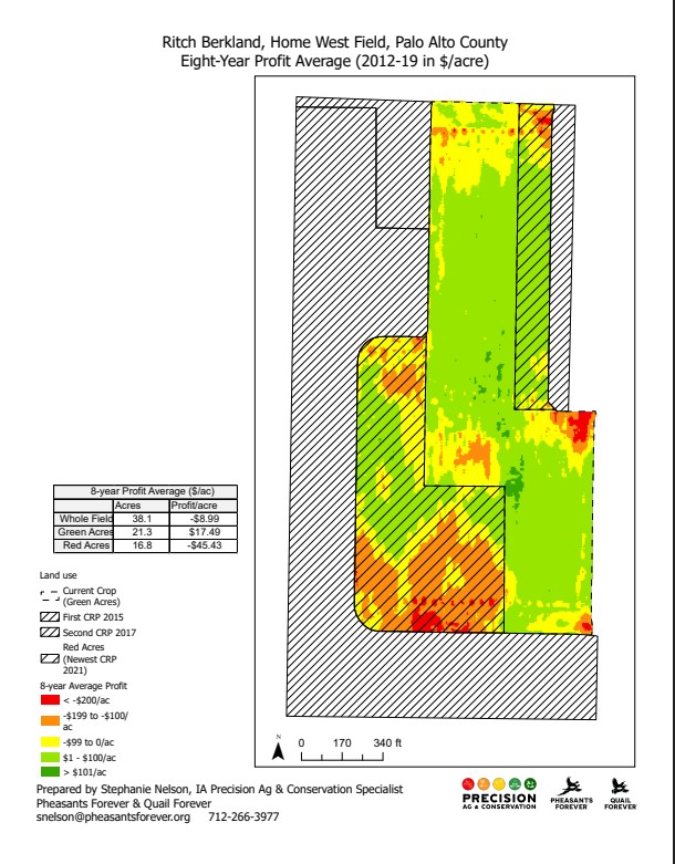
The maps above illustrate that yield and profits coincide with each other. High yielding areas, particularly the central and lower northern sections, regularly produce more than 200 bushels per acre. These areas generate the strongest profits, often exceeding $100 per acre in gross income over the six-year monitoring period between 2013 and 2019.
However, the southern and southwestern zones of the farm consistently show yields below 150 bushels per acre corresponding with lower returns in those areas. These patterns indicate chronic limitations in those southern zones, likely soil or moisture challenges, that limit the potential for maximum profitability regardless of any management practices that could be implemented.
Another contrast between the yield and profit maps is that several moderate to good yield areas still produce only marginal profits or, in some cases, negative profit margins. Where yields fall in the 176- 200 bushels per acre range, the profitability of those areas remains near breakeven, suggesting that the input costs required to maintain those yields are greater than any profit generated. When comparing the green acres, or areas that the NDVI index indicate are healthy plants with healthy yields, the green acres average nearly 193 bushels per acre and have a profit of $17 to$18 per acre. Meanwhile, red acres have lower yields and lose over $45 per acre annually, reinforcing their suitability for conservation programs like CRP.
So, What Does All This Mean?
Mapping the yield and profit with harvest monitor data reveals and quantifies differences across the field so they can then be managed more effectively and produces maps that are helpful to understand field variability at the subfield level. Most farmers can point to the wet spots on their land blindfolded! What’s harder to see is how much those areas are actually costing them and pulling down the field’s overall average.
Farmers also probably know their whole field’s average yield, but that field-level yield number hides the differences that are revealed through this mapping. For this field, the 6-year yield average was 183.7 bushels of corn per acre. The yield map shows that much of the field consistently yielded over 200 bushels per acre, while that southwest corner was below 150.
When yield data is mapped over a longer period, hidden patterns often emerge, bringing the economic impact of underperforming areas into focus and helping farmers develop strategies to improve profitability. This approach allows farmers like Ritch to make money by spending less, while also increasing biodiversity and creating an oasis for wildlife.