

Mission
Equipping farmers to build resilient farms and communities.
Vision
An Iowa with healthy soil, healthy food, clean air, clean water, resilient farms and vibrant communities.
Values
- Welcoming everyone
- Farmers leading the exchange of experience and knowledge
- Curiosity, creativity, collaboration and community
- Resilient farms now and for future generations
- Stewardship of land and resources
Broadening Our Big Tent
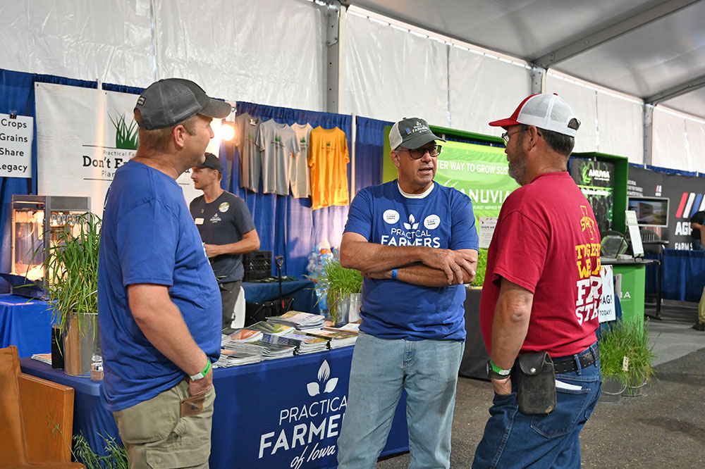
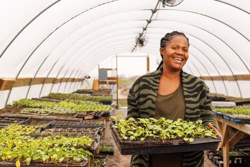
Welcoming everyone and creating a culture of mutual respect have always been core PFI values. We believe that a rich tapestry of farm types, sizes, practices and perspectives enriches our understanding and broadens our impact. In all our gathering spaces, we strive for an environment where everyone feels valued, represented and invited to engage with PFI, and has equal access to our network, programs and resources. Broadening our “big tent” means forming authentic relationships, understanding different needs and barriers and providing support and resources to match. Part of inhabiting the big tent is honestly examining, identifying and addressing all forms of discrimination.
Impact Rooted in Farms and Communities
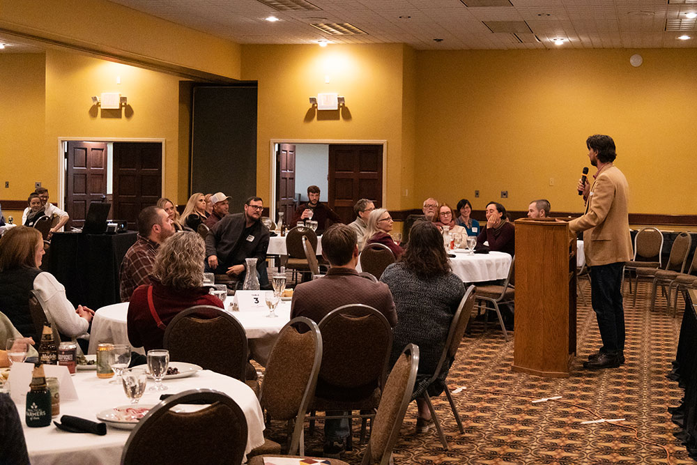
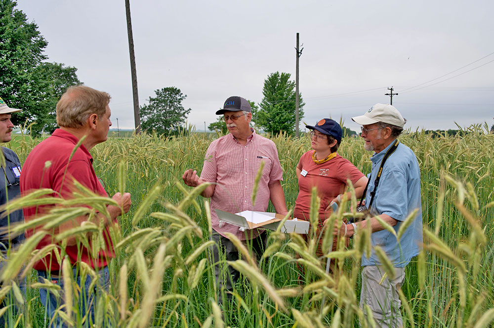
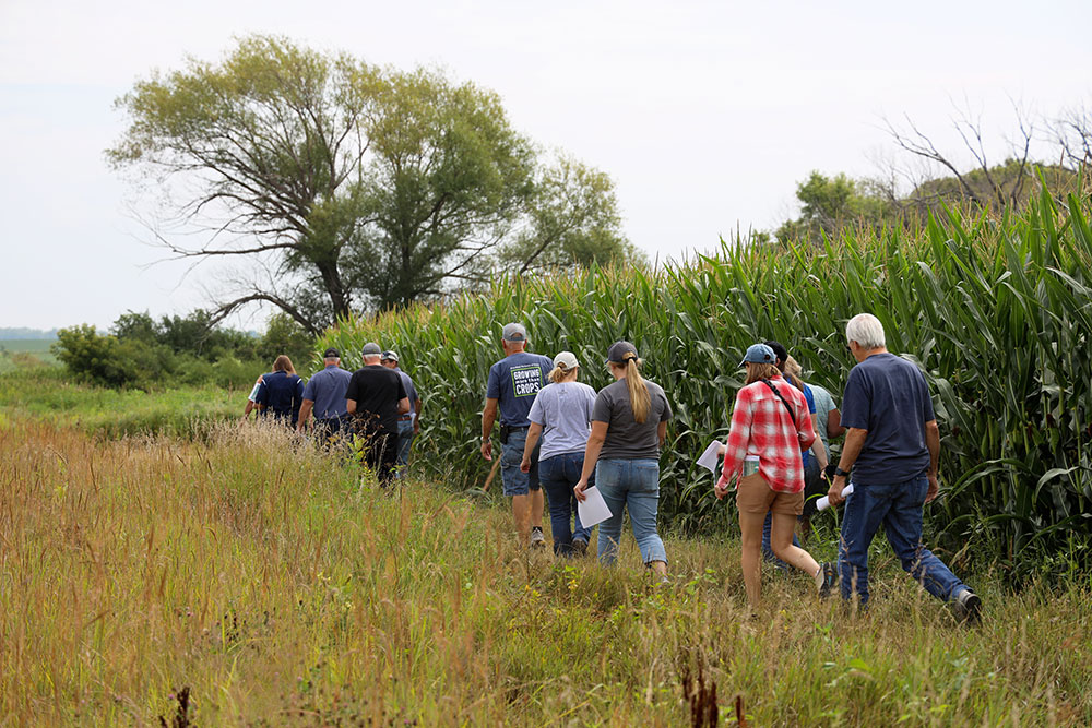
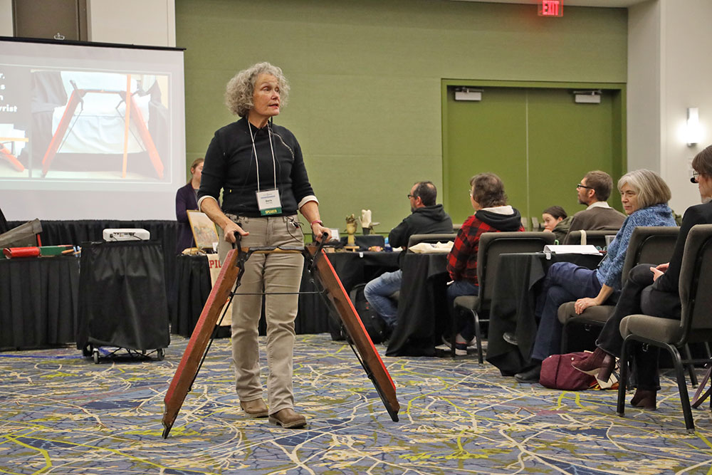
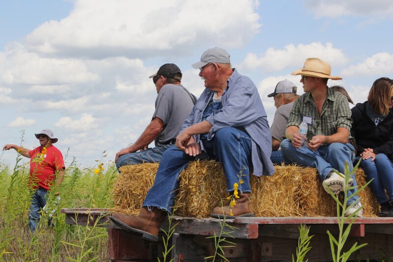
Each year, Practical Farmers of Iowa supports farmers through learning, research and connection. These numbers reflect the reach and impact of farmer-led work across Iowa and beyond.
7,086
Event attendees in 2025
Farmers and supporters engaged in field days, workshops, virtual events and more.
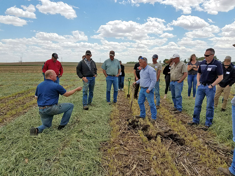
185
On-farm research trials
In 2025, 107 PFI farmers designed and led 185 trials to test real-world solutions on their own farms.
$12.2M
to support farmers
PFI farmers received direct support for participating in cost-shares, hosting events, conducting on-farm research and serving as mentors.
Our Commitments
Civility Commitments
At PFI, we use civility commitments guide how we engage with one another. Especially when our perspectives differ, these commitments help us create a welcoming environment where everyone can learn, connect and thrive.
We commit to:
- Learning from each other.
- Acknowledging differences in beliefs, values, politics, culture, interests and experiences.
- Listening respectfully to each other, recognizing and respecting different levels of understanding.
- Actively seeking common ground.
- Creating an environment free from language and symbols that are hostile, intimidating or abusive of others.
History
Farm Crisis & the Call for New Approaches
Practical Farmers of Iowa was founded in 1985, during a period when farmers in Iowa were under serious economic strain. Commodity prices had collapsed, thousands of farms were failing and mounting evidence showed conventional practices were harming the land. Many farmers began searching for ways to diversify their operations and reduce dependence on expensive inputs.
Founding & Early Philosophy
PFI's roots trace back to a meeting sparked by Larry Kallem of the Iowa Institute for Cooperatives and Dick and Sharon Thompson, who were experimenting with sustainable, low-input farming methods. After a well-received workshop in 1984, the Thompsons, Larry and other early participants launched PFI so that farmers could share research and practical results.
Growth & Mission in Practice
From the start, PFI emphasized randomized, replicated on-farm research driven by farmers themselves. While the initial focus was on field crops and livestock, the scope gradually expanded to horticulture, small grains, local foods and more. Over time, PFI has grown substantially, and now has 9,000-plus members in Iowa and 40 other states across the country. Practical Farmers of Iowa continues to center its work around farmer-led investigation, information sharing and resilience.